How to build an interactive web component with LitElement
Last spring, I worked on a project where we supplied static content from a WordPress site to a React app via the REST API. The challenge we faced in this project was that the content from the WordPress site included interactive components.
Last spring, I worked on a project where we supplied static content from a WordPress site to a React app via the REST API. The challenge we faced in this project was that the content from the WordPress site included interactive components.
Creating a content block for interactive components in a standard WordPress install is no problem. We can detect when the block is used, and enqueue the JavaScript (JS) required for the blocks's interactivity. But when that same block is saved to the WP REST API, only its markup is available, and replicating the block's interactivity in a JS application becomes more challenging.
Web components offer an enticing solution to this problem. Web components allow developers to create custom elements (i.e. HTML elements), that encapsulate their own styles and JS. Now, if we ship the markup for the custom element over an API, and also include the web component scripts in our application, we've solved the problem sharing interactive components.
In this post, I'll walk through building an interactive accordion web component that can be used in any type of web application.
Pre-requisites for building web components
Building a web component requires a decent amount of JS knowledge. DOM expertise is a must, comfort with ES2015 classes is important, and you will need to know a few Array methods including map() and Array.from().
You won't need extensive command line experience for this tutorial, but you will need to run a few commands. With all this said, let's define what we're building.
To demonstrate how web components can handle interactivity, we're going to build an accordion component. Here are the requirements for our accordion:
- allow a user to expand & collapse panels
- have an option to determine whether one panel is open at a time, or if several can be open
- use accessible markup
- support keyboard users
Spinning up the accordion project
We'll start the accordion component by creating a new directory and initializing a new npm project.
mkdir my-accordion
cd my-accordion
npm init
Follow the prompts on the screen to initialize your npm project.
Next, install Lit Element.
npm install lit-elementAs the site states, Lit Element is “a simple base class for creating fast, lightweight web components,” that makes spinning up new web components super easy. It offers utilities for easily styling web components, creating component templates, and lifecycle hooks for updating your web component.
Before proceeding to the next step, review the Lit Element starting guide to setup your environment to use Lit Element locally. Most importantly, you should make sure you have the polymer-cli installed.
Now that we have Lit Element set up, let's add some new files to our project. We only need a JS and HTML file to start. Including a .gitignore file is a good idea if you plan to push your project to a remote Git server. The project structure should look something like this:
.
├── node_modules
├── .gitignore
├── index.html
├── index.js
├── package-lock.json
└── package.json
Now that our project is spun up, we're ready to start coding.
Scaffolding a basic component
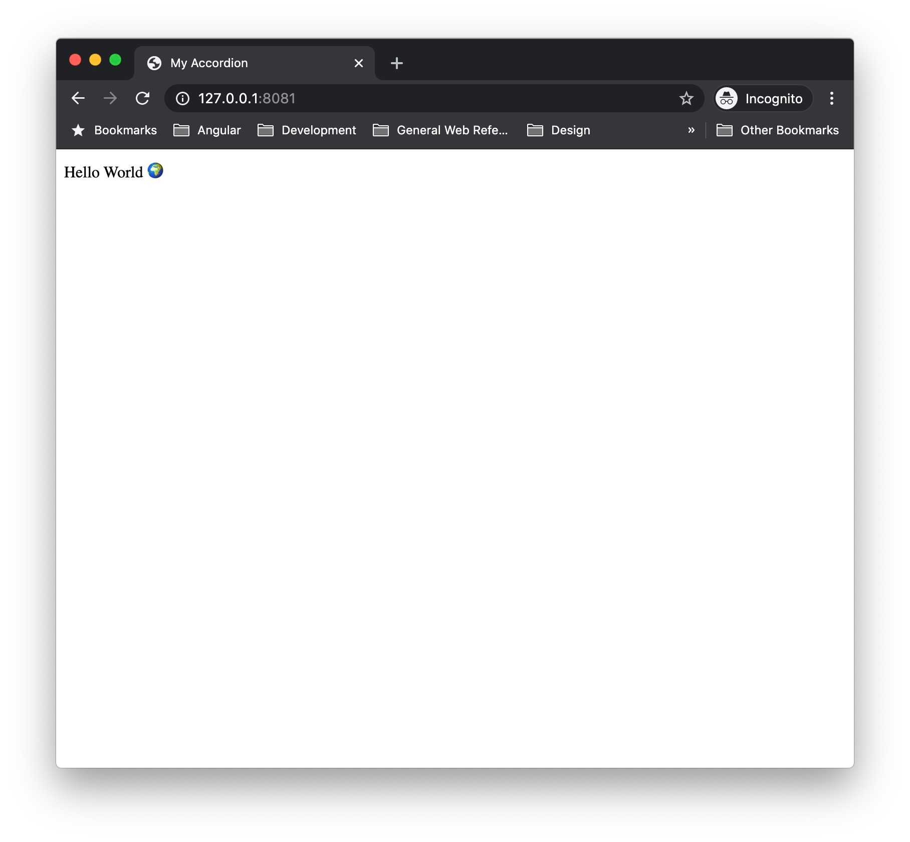
Let's start by simply outputting “Hello World”. Add the following code to index.js:
// index.js
import { LitElement, html } from 'lit-element';

class MyAccordion extends LitElement {
  render() {
    return html` Hello World 🌍 `;
  }
}

customElements.define('my-accordion', MyAccordion);
The render() method returns our component's HTML template. The html function is simply a wrapper for creating the template. customElements.define() allows us to define a name for our web component, and associate the extended LitElement class to this tag.
Now that the web component is defined, we're ready to use it in our HTML. Let's add a basic HTML5 scaffold to index.html adding our web component script, and placing an instance of our custom element in the body:
<!-- index.html -->
<!DOCTYPE html>
<html lang="en">
  <head>
    <title>My Accordion</title>
    <script type="module" src="index.js"></script>
  </head>
  <body>
    <my-accordion></my-accordion>
  </body>
</html>
The script tag imports the index.js file where we defined our new web component. We added type="module" because we're using JS modules in this project (e.g. import { LitElement, html } from LitElement;).
<my-accordion></my-accordion> is what actually outputs our new web component to the screen. If you kick off polymer serve in your terminal, and visit the link, you should see our new web component. 🎉
We've taken our first step to creating a web component, by creating a component that outputs static text, but now it's time to get into building our accordion.
Adding the accordion template
First, we'll update the render() method and replace Hello World 🌍 with a slot.
// index.js
import { LitElement, html } from 'lit-element';

class MyAccordion extends LitElement {
  render() {
    return html` <slot></slot> `;
  }
}

customElements.define('my-accordion', MyAccordion);
A slot is like a placeholder for other content in a component. In this case, we've left our slot unnamed, but you can name slots to have specific areas for your component's content. At this point, this is all we need the accordion file to do. We'll use this component as a wrapper for our “panels”, and actually output our content in a separate web component.
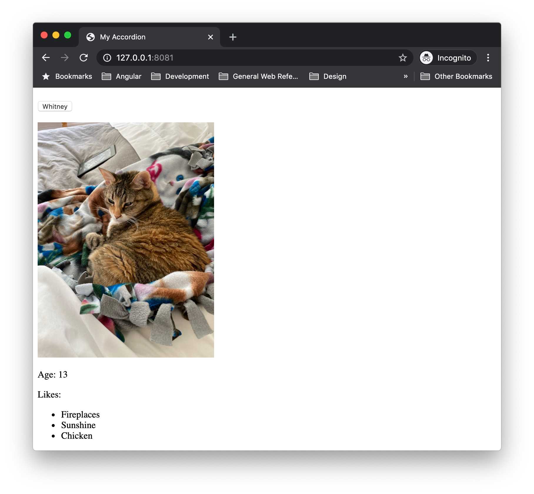
Let's go ahead and create a new JS file called panel.js. Following the WAI-ARIA Authoring Practices for accordions, we'll do our best to ensure our panel template uses semantic markup and ARIA attributes appropriately.
import { LitElement, html } from 'lit-element';

class MyAccordionPanel extends LitElement {
  render() {
    return html`
      <h3>
        <button
          id="button1"
          type="button"
          aria-expanded="true"
          aria-controls="panel1"
        >
          Whitney
        </button>
      </h3>
      <div id="panel1" role="region" aria-labelledby="panel1">
        <img src="" alt="Whitney kitten taking a nap in her human's bed" />
        <p>Age: 13</p>
        <p>Likes:</p>
        <ul>
          <li>Fireplaces</li>
          <li>Sunshine</li>
          <li>Chicken</li>
        </ul>
      </div>
    `;
  }
}

customElements.define('my-accordion-panel', MyAccordionPanel);
We can quickly test the panel behaves as expected. First, add the following line to index.js:
import './panel';Then add an instance of the panel inside your my-accordion element in index.html:
<!-- index.html -->
<my-accordion>
  <my-accordion-panel></my-accordion-panel>
</my-accordion>
Now if we refresh the browser, we should see our updated web component with the my-accordion-panel component.
This is a good start, but we want to allow users to add their own content to my-accordion-panel. The easiest change to make the component more flexible is to replace the content within the div with a slot. Next, we'll introduce properties to handle the button text and panel state.
import { LitElement, html } from 'lit-element';

class MyAccordionPanel extends LitElement {
  constructor() {
    super();

    this.label = '';
    this.expanded = false;
  }

  static get properties() {
    return {
      label: { type: String },
      expanded: { type: Boolean },
    };
  }

  expand() {
    return (this.expanded = !this.expanded);
  }

  kebabCase(string) {
    return string.replace(/\s/g, '-').toLowerCase();
  }

  render() {
    return html`
      <h3>
        <button
          id="${this.kebabCase(this.label)}-button"
          type="button"
          .aria-expanded="${this.expanded}"
          aria-controls="${this.kebabCase(this.label)}-panel"
          @click="${() => this.expand()}"
        >
          ${this.label}
        </button>
      </h3>
      <div
        id="${this.kebabCase(this.label)}-panel"
        role="region"
        aria-labelledby="${this.kebabCase(this.label)}-button"
        .hidden="${!this.expanded}"
      >
        <slot></slot>
      </div>
    `;
  }
}

customElements.define('my-accordion-panel', MyAccordionPanel);
The first thing we're doing is setting up the class constructor. Because the panel class extends LitElement, we need to call super(), then we can add and set default values for the properties we want to use: label and expanded.
Next, we set up the properties() getter from LitElement. Properties are useful because LitElement will always be listening for changes to properties, and will update our component appropriately when changes are detected. In this instance, we're doing two things when call the properties getter:
- Declare the properties we're going to use in the component.
- Convert the property type.
There's a bit of nuance when thinking about converting the property type, so let's look at an example.
Our button has an aria-expanded attribute, and when we set this attribute, we expect it to be either aria-expanded="true" or aria-expanded="false". HTML attributes are always represented as strings regardless of whether they are boolean values (as in this case), or not. By using the properties() getter, we can tell LitElement that when we're working with expanded in the pure JS, we expect it to be converted to a boolean, but when it's used in the HTML template it's converted to a string.
After setting up the properties() getter, we have a method to handle updating the state of expanded, and a helper method, kebabCase, that will make it easier to create unique IDs for the panels in the HTML.
Finally, the render() method has been updated to use the newly defined properties. You may notice that aria-expanded and hidden both have a . prepended to them. The . tells LitElement to bind that attribute's property to one of our declared properties so it renders correctly in the HTML.
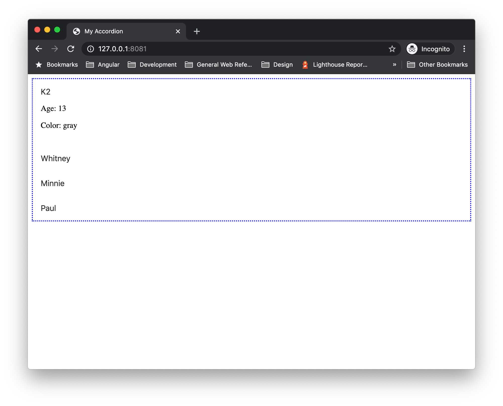
Now we can update the content of my-accordion in index.html:
<my-accordion>
  <my-accordion-panel label="K2" expanded="true">
    <p>Age: 13</p>
    <p>Color: gray</p>
  </my-accordion-panel>
  <my-accordion-panel label="Whitney">
    <p>Age: 13</p>
    <p>Color: orange</p>
  </my-accordion-panel>
  <my-accordion-panel label="Minnie">
    <p>Age: 4</p>
    <p>Color: gray</p>
  </my-accordion-panel>
  <my-accordion-panel label="Paul">
    <p>Age: 3</p>
    <p>Color: orange</p>
  </my-accordion-panel>
</my-accordion>
Here, you'll see that we're using label and expanded as attributes. These will be passed down to my-accordion-panel as properties.
If you reload the page, you will see a fully-functioning accordion.
Styling a web component
The basic mechanics of the accordion are fine, but it doesn't look pretty, so in this section we'll focus on adding styles.
We'll start our styles by adding a border around my-accordion. To do this, we'll add a styles() getter to the MyAccordion class:
import { LitElement, html, css } from 'lit-element';
import './panel';

class MyAccordion extends LitElement {
  static get styles() {
    return css`
      :host {
        border: 1px solid gray;
        display: block;
      }
    `;
  }

  render() {
    return html` <slot></slot> `;
  }
}

customElements.define('my-accordion', MyAccordion);
We use :host here to target the host (i.e. container) of the shadow DOM. The shadow DOM here being the contents of our component's HTML template. By default, a host does not have any properties, so in order to get the border to display properly, display: block needs to be added.
A border is the only style I want to add to my-accordion for now, so let's move onto styling the panel.
// panel.js
class MyAccordionPanel extends LitElement {
  /* ... */

  static get styles() {
    return css`
      :host {
        display: block;
        padding: 1rem;
      }

      h3 {
        margin: 0;
      }

      button {
        background-color: transparent;
        border: 0;
        display: block;
        font-size: 1rem;
        padding: 0;
        text-align: left;
        width: 100%;
      }

      div {
        margin-top: 1rem;
      }
    `;
  }

  /* ... */
}

customElements.define('my-accordion-panel', MyAccordionPanel);
It might be alarming to see no classes used in the styles, but the neat thing about web components and the shadow DOM is that we can use element selectors in our styles with no fear of them being overwritten by styles in our application.
But if adding button { background-color: hotpink; } in the application styles doesn't work, how do we update our web components' styles from our application?
Creating theme-able components with CSS custom properties
CSS custom properties, commonly referred to as CSS variables, hold the key to manipulating styles within the shadow DOM of a web component. Let's look at the panel as an example. Currently, we have a border declaration, but we can update this to use a CSS custom property:
// index.js
class MyAccordion extends LitElement {
  static get styles() {
    return css`
      :host {
        border: var(--my-accordion-border, 1px solid gray);
        display: block;
      }
    `;
  }

  /* ... */
}

customElements.define('my-accordion', MyAccordion);
To use CSS custom properties as values in your CSS, it must be wrapped in var(), which accepts two parameters:
- The custom property (variable) name, which must be proceeded with
--. - An optional default value in the case the variable passed in is not defined.
In the above example, I used our previous border declaration as my default for the --my-accordion-border variable.
To change the border style in my site CSS, I simply add a declaration to set the variable:
:root {
  --my-accordion-border: 2px dotted blue;
}
Using :root here allows me to set the variable at the root-level (i.e. html-level). If necessary, variables can be scoped to classes or tags.
Now let's update the panel to allow more customization:
// panel.js
class MyAccordionPanel extends LitElement {
  /* ... */

  static get styles() {
    return css`
      :host {
        display: block;
        padding: var(--my-accordion-panel-padding, 1rem);
      }

      h3 {
        margin: 0;
      }

      button {
        background-color: var(--my-accordion-panel-button-bg, transparent);
        border: 0;
        display: block;
        font-size: var(--my-accordion-panel-font-size, 1rem);
        padding: 0;
        text-align: var(--my-accordion-panel-button-text-align, left);
        width: 100%;
      }

      div {
        margin-top: var(--my-accordion-panel-margin-top, 1rem);
      }
    `;
  }

  /* ... */
}

customElements.define('my-accordion-panel', MyAccordionPanel);
Now that our accordion is fairly customizable, let's refactor things a bit to make it more accessibility friendly.
Improving component interactivity
In its current state, our accordion functions pretty well. We can open and close it with the click of a button, and we have a basic level of keyboard accessibility using TAB and ENTER. But according to the WAI-ARIA guidelines for accordions, the accordion should support arrow key interaction and single / multi-panel functionality. In this section, we'll refactor our component to improve its functionality and accessibility.
In order to support the single-panel functionality of the accordion, we need to keep track of the panel states in MyAccordion rather than individually in MyAccordionPanel. An individual panel only knows about it's state, and never about the state of it's neighbors. So if I have my "K2" panel open, and I click "Minnie", "K2" won't know to close because he only cares about his state.
// index.js
class MyAccordion extends LitElement {
  constructor() {
    super();

    this.panels = [];
    this.multiPanel = false;
    this.initialized = false;
  }

  static get properties() {
    return {
      panels: { type: Array },
      multiPanel: { type: Boolean },
    };
  }

  /* ... */
}

customElements.define('my-accordion', MyAccordion);
So the first thing we'll need is a list of all the panels (this.panels) that belong to the MyAccordion. We'll also set a flag (this.multiPanel) to determine whether we'll allow one panel to be open at a time, or multiple panels to be open at once. Finally, we have a flag to help us determine whether the component has been initialized (this.initialized). Since this is truly a flag and not a property of the web component, it is not part of the properties() getter.
Next, we'll implement the shouldUpdate() lifecycle method. shouldUpdate() runs any time our web components' properties change (including when they are initialized in the constructor).
// index.js
class MyAccordion extends LitElement {
  /* ... */

  shouldUpdate(changedProperties) {
    if (!this.initialized) {
      this.panels = Array.from(this.children);
      this.panels.map((panel) => panel.setAttribute('tabIndex', '0'));
      this.addEventListener('click', this.handleClick);
      this.addEventListener('keyup', this.handleKeyup);
      this.initialized = true;
    }

    return changedProperties;
  }

  handleClick(event) {}

  handleKeyup(event) {}

  /* ... */
}

customElements.define('my-accordion', MyAccordion);
We're doing a few things here to instantiate our component:
- Updating the
panelsarray to a list of DOM elements (i.e.my-accordion-panel) - Setting the
tabIndexon each panel - Adding event listeners
I've also added placeholder methods for handling the click and keyup events. We'll focus on implementing handleClick() first.
Since we'll be handling clicks within MyAccordion, we can remove the current click functionality from MyAccordionPanel:
// panel.js
class MyAccordionPanel extends LitElement {
  constructor() {
    super();

    this.label = '';
    this.expanded = false;
  }

  static get properties() {
    return {
      label: { type: String },
      expanded: { type: Boolean },
    };
  }

  static get styles() {
    return css`
      :host {
        display: block;
        padding: var(--my-accordion-panel-padding, 1rem);
      }

      h3 {
        margin: 0;
      }

      button {
        background-color: var(--my-accordion-panel-button-bg, transparent);
        border: 0;
        display: block;
        font-size: var(--my-accordion-panel-font-size, 1rem);
        padding: 0;
        text-align: var(--my-accordion-panel-button-text-align, left);
        width: 100%;
      }

      div {
        margin-top: var(--my-accordion-panel-margin-top, 1rem);
      }
    `;
  }

  kebabCase(string) {
    return string.replace(/\s/g, '-').toLowerCase();
  }

  render() {
    return html`
      <h3>
        <button
          id="${this.kebabCase(this.label)}-button"
          type="button"
          .aria-expanded="${this.expanded}"
          aria-controls="${this.kebabCase(this.label)}-panel"
        >
          ${this.label}
        </button>
      </h3>
      <div
        id="${this.kebabCase(this.label)}-panel"
        role="region"
        aria-labelledby="${this.kebabCase(this.label)}-button"
        .hidden="${!this.expanded}"
      >
        <slot></slot>
      </div>
    `;
  }
}

customElements.define('my-accordion-panel', MyAccordionPanel);
In the code above, I've removed the exapand() method, and removed the @click that called it from the button. Now if you try interacting with my-accordion in the browser, nothing should happen. Let's focus on reimplementing this functionality in the handleClick() method on MyAccordion.
// index.js
class MyAccordion extends LitElement {
  /* ... */

  handleClick(event) {
    const { target } = event;

    this.panels.map((panel) => {
      if (panel === target) {
        if (panel.hasAttribute('expanded')) {
          panel.removeAttribute('expanded');
        } else {
          panel.setAttribute('expanded', true);
        }
      }
    });

    return this.panels;
  }
}

customElements.define('my-accordion', MyAccordion);
Clicking within my-accordion, will return an event, and the target of this event will be one of our accordion panels. We want to take the event.target (which I destructured above with const { target } = event;) and compare it to our array of panels. When target matches the current panel, we need to check whether it's currently expanded or not. We'll return the panels once we've mapped over the entire panels array.
The beauty of having the panels property on the component is that anytime that property changes, the shouldUpdate() lifecycle method fires, causing the component's DOM to update in the browser. Go ahead and try clicking on the panels in the browser, it should work similarly to how it did previously. We can update the handleClick() method further to check whether the accordion supports multi-panel.
// index.js
class MyAccordion extends LitElement {
  /* ... */

  handleClick(event) {
    const { target } = event;

    this.panels.map((panel) => {
      if (
        !this.multiPanel &&
        panel !== target &&
        panel.hasAttribute('expanded')
      ) {
        panel.removeAttribute('expanded');
      }

      if (panel === target) {
        if (panel.hasAttribute('expanded')) {
          panel.removeAttribute('expanded');
        } else {
          panel.setAttribute('expanded', true);
        }
      }
    });

    return this.panels;
  }
}

customElements.define('my-accordion', MyAccordion);
Until now, the panel actually defaulted to multi-panel support. As we mapped over each item in panels, the handleClick() method merely checked whether the target panel's state changed. To fully implement multi-panel, we'll first check whether the multiPanel property is truthy, and the current panel is not the same as target and whether the current panel has the expanded attribute. If all those conditions are true, we'll close the panel.
If you give the updated accordion a whirl, it should close any previously opened panel when you select a new panel. Adding multiPanel=true to the my-accordion element will allow multiple panels to be open at once.
Improving keyboard interactivity
Implementing the handleClick() method gives us a good baseline for handling our keyboard interaction. To avoid repetition, the first thing we need to do is refactor things a bit to abstract the functionality in handleClick() to it's own method. This will allow us to reuse the functionality in handleKeyup():
// index.js
class MyAccordion extends LitElement {
  /* ... */

  handleClick(event) {
    const { target } = event;
    this.updatePanels(target);
  }

  handleKeyup(event) {}

  updatePanels(target) {
    this.panels.map((panel) => {
      if (
        !this.multiPanel &&
        panel !== target &&
        panel.hasAttribute('expanded')
      ) {
        panel.removeAttribute('expanded');
      }

      if (panel === target) {
        if (panel.hasAttribute('expanded')) {
          panel.removeAttribute('expanded');
        } else {
          panel.setAttribute('expanded', true);
        }
      }
    });

    return this.panels;
  }

  /* ... */
}

customElements.define('my-accordion', MyAccordion);
The first thing we'll do to implement handleKeyup() is stub out the switch we'll use to check which key has been pressed.
// index.js
class MyAccordion extends LitElement {
  /* ... */

  handleKeyup(event) {
    const { keyCode } = event;
    let { target } = event;

    // Prevent page scrolling when component has focus.
    event.preventDefault();

    switch (keyCode) {
      // Arrow down.
      case 40:
        break;

      // Arrow up.
      case 38:
        break;

      // Enter & Space.
      case 13:
      case 32:
        break;

      default:
        break;
    }
  }

  /* ... */
}

customElements.define('my-accordion', MyAccordion);
We're using keyCode here instead of key because the value returned for SPACE is blank and difficult to manage. I used let for the target because we'll be reassigning the value in the next step. Implementing the logic for each of the keyup scenarios is relatively simple:
// index.js
class MyAccordion extends LitElement {
  /* ... */
  handleKeyup(event) {
    const { keyCode } = event;
    let { target } = event;

    // Prevent page scrolling when component has focus.
    event.preventDefault();

    switch (keyCode) {
      // Arrow down.
      case 40:
        if (target !== this.panels[this.panels.length - 1]) {
          target = target.nextElementSibling;
        } else {
          target = this.panels[0];
        }
        break;

      // Arrow up.
      case 38:
        if (target !== this.panels[0]) {
          target = target.previousElementSibling;
        } else {
          target = this.panels[this.panels.length - 1];
        }
        break;

      // Enter & Space.
      case 13:
      case 32:
        this.updatePanels(target);
        break;

      default:
        break;
    }

    target.focus();
  }

  /* ... */
}

customElements.define('my-accordion', MyAccordion);
When we press the down arrow, we check to see whether the target is the last panel in panels. If it is, we set the target to the first panel in panels. Otherwise, we simply set the target panel to the next my-accordion-panel.
Conversely, for arrow up, we check to see whether the target is the first panel in panels. If so, target is set to the last panel in panels, otherwise it's the previous my-accordion-panel. Finally, we trigger the expand / collapse functionality when ENTER or SPACE are pressed by calling updatePanels().
To help users keep track of which panel is selected, we update focus by calling target.focus() after each keyup.
All of this is great, but there is one small problem: tab functionality is now broken when my-accordion has focus. Let's make one more change to restore tab functionality:
import { LitElement, html, css } from 'lit-element';
import './panel';

class MyAccordion extends LitElement {
  /* ... */

  setPreviousPanel(target) {
    if (target !== this.panels[0]) {
      target = target.previousElementSibling;
    } else {
      target = this.panels[this.panels.length - 1];
    }
  }

  setNextPanel(target) {
    if (target !== this.panels[this.panels.length - 1]) {
      return target.nextElementSibling;
    } else {
      return this.panels[0];
    }
  }

  handleKeyup(event) {
    const { keyCode } = event;
    let { target } = event;

    // Prevent page scrolling when component has focus.
    event.preventDefault();

    switch (keyCode) {
      // Tab.
      case 9:
        if (event.shiftKey) {
          target = this.setPreviousPanel(target);
        } else {
          target = this.setNextPanel(target);
        }
        break;

      // Arrow down.
      case 40:
        target = this.setNextPanel(target);
        break;

      // Arrow up.
      case 38:
        target = this.setPreviousPanel(target);
        break;

      // Enter & Space.
      case 13:
      case 32:
        this.updatePanels(target);
        break;

      default:
        break;
    }

    target.focus();
  }

  /* ... */
}

customElements.define('my-accordion', MyAccordion);
We abstract out the check to set the next / previous panel so we can use it in our arrow and tab keyups without duplicating code. Adding a check for event.shiftKey in the TAB case allows us to handle instances when a user presses SHIFT + TAB in sequence.
And that's it! We now have a fully-functioning, accessible accordion web component:

Check out the full source code for this tutorial on Github. This web component is also an npm package, which can be easily installed with npm install --save @alcatraz-components/accordion. Be sure to check out the Github link for more information about adding the package to your app.